

Women’s Health Melbourne
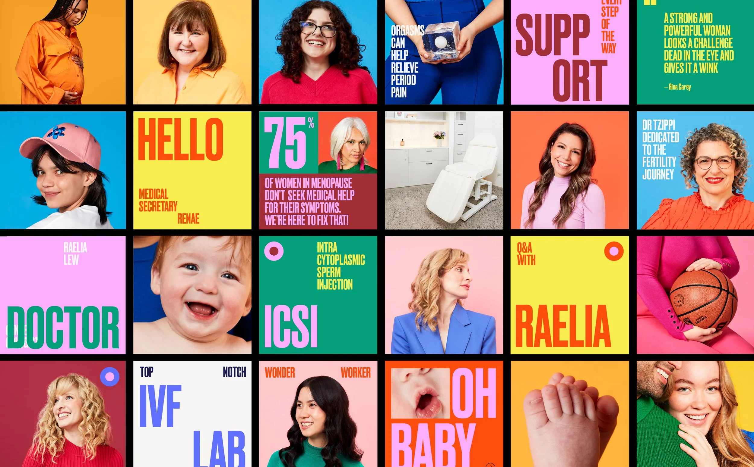
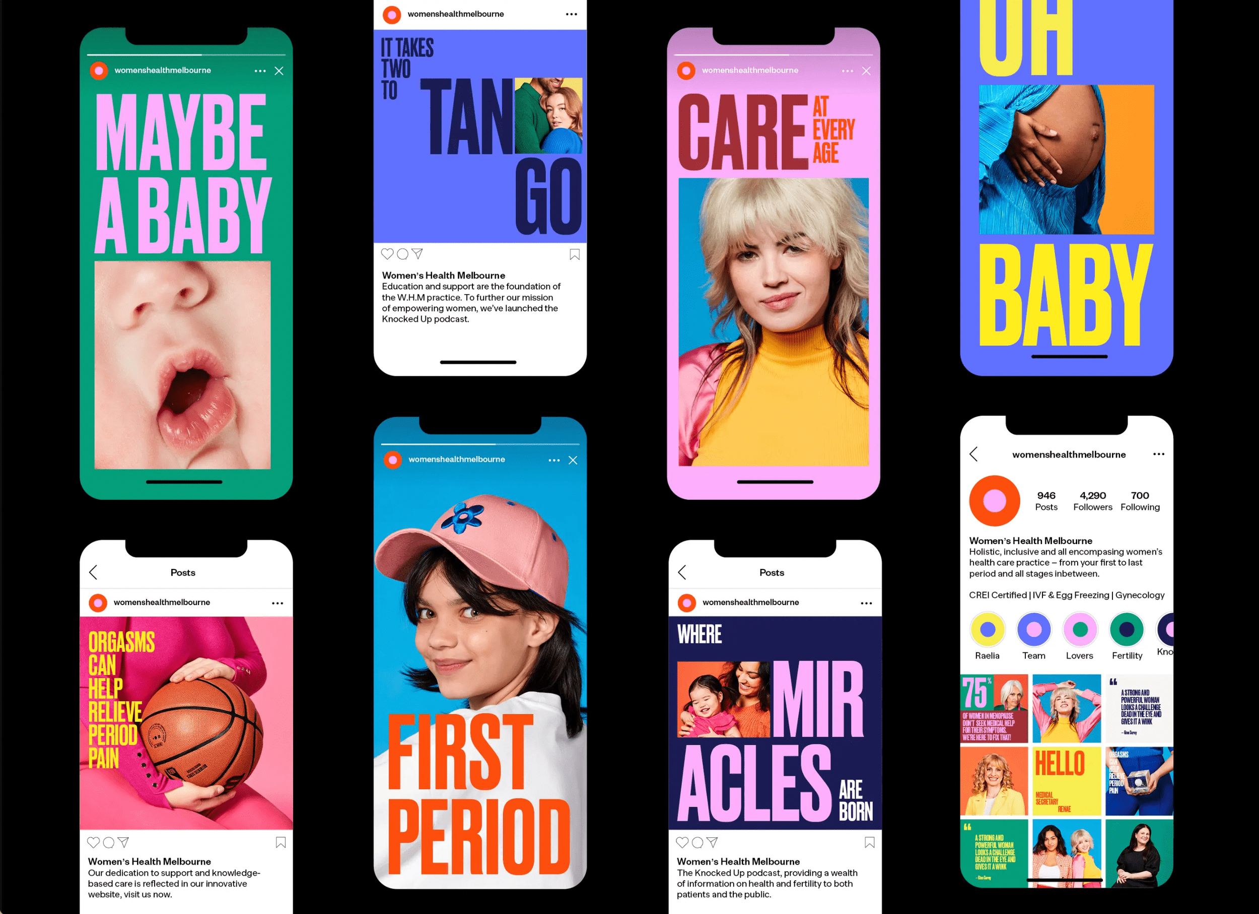
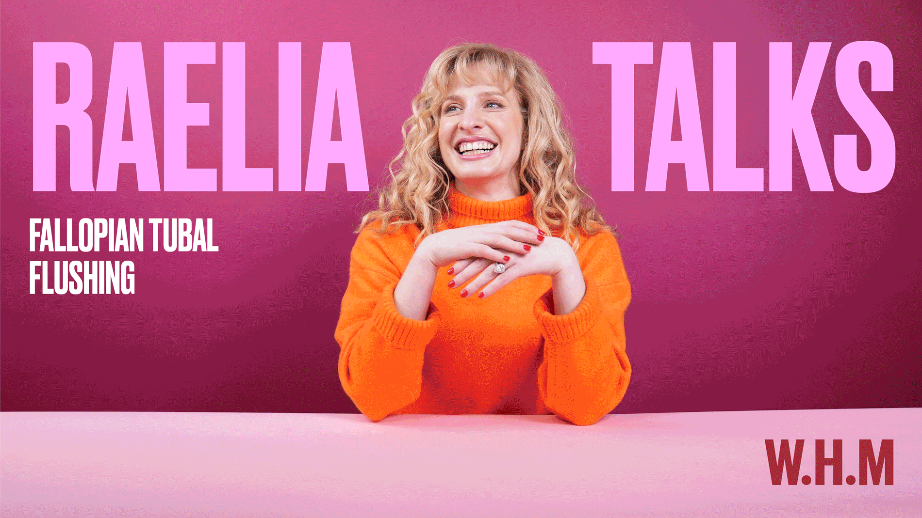
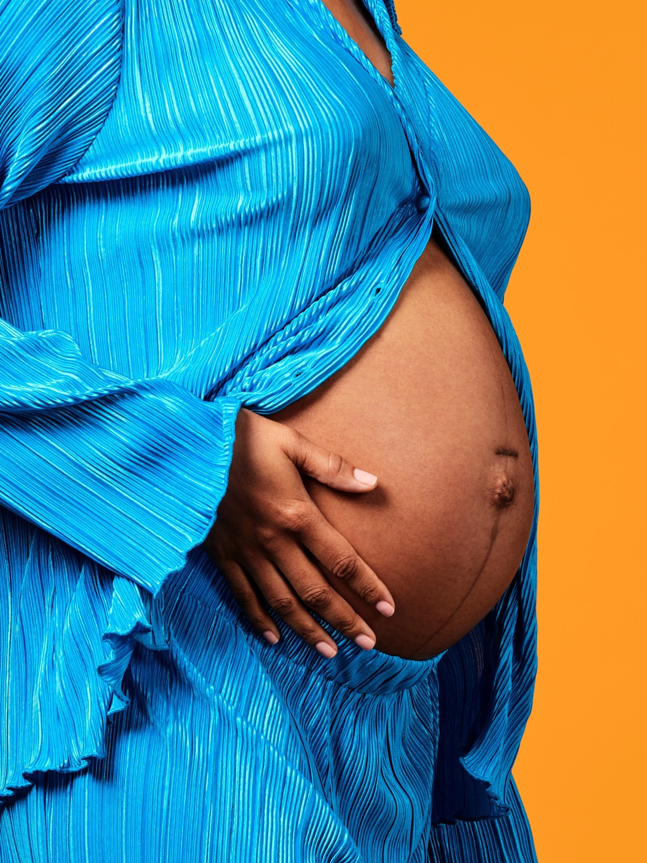
Women’s Health Melbourne is dedicated to breaking down the stigma and shame surrounding women’s health and fertility. With a mission to alleviate these barriers through education, empowerment, challenging norms and uplifting patients. The positively charged visual language has been designed to intrigue and engage, showcasing women at every stage of life, from the exciting journey of puberty to the wisdom of menopause.
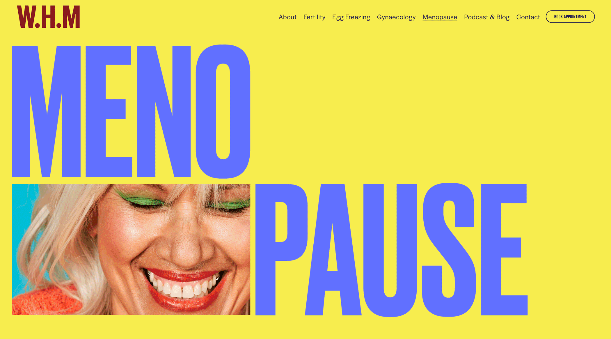
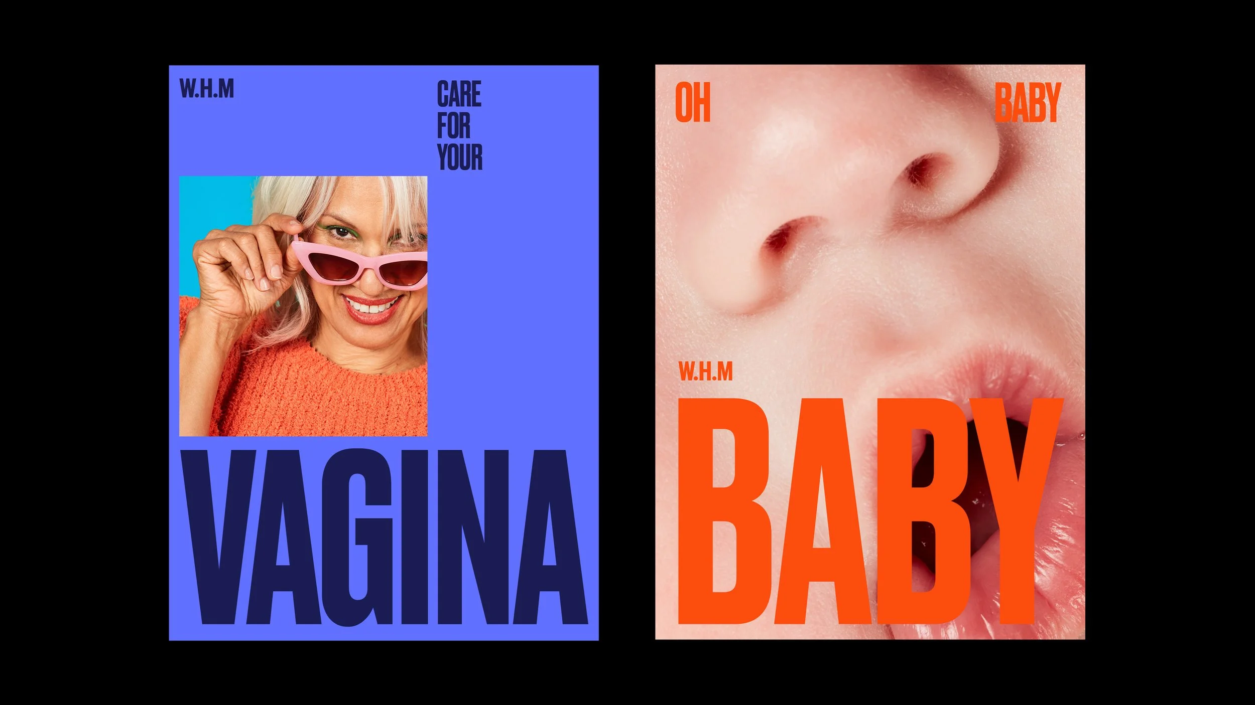
The innovative and all-encompassing approach to women’s health is embodied in their visual identity, where the traditional apostrophe has been replaced with an egg-like circular motif. This symbol not only represents the complete journey of womanhood but also nods to the idea of new beginnings. The condensed typeface used embodies a bold and rebellious spirit, reflecting the unconventional approach of the W.H.M practice.
W.H.M’s dedication to support and knowledge-based care is reflected in their innovative website. Breaking away from the oftentimes bland and medical-looking visual identities it’s an unconventional approach. The result creates an exciting online presence that serves as an educational resource. To further their mission of empowerment, they’ve launched the “Knocked Up” podcast, providing a wealth of health information to the public. The podcast tile was carefully crafted to be legible even at small scale.
-
I created and completed this work at A Friend of Mine Melbourne, and was creative directed by founder, Suzy Tuxen.
Photography by Shelley Horan
Wardrobe by Jam Baylon
Prop styling by Bridget Wald
Branded Video by WVFRM -
Brand Identity
EDM
Social
Art Direction
Branded videos
Website
Digital
Podcast
Signage
Website Scroll Press Play
Website Site Headers


Branded Video Covers


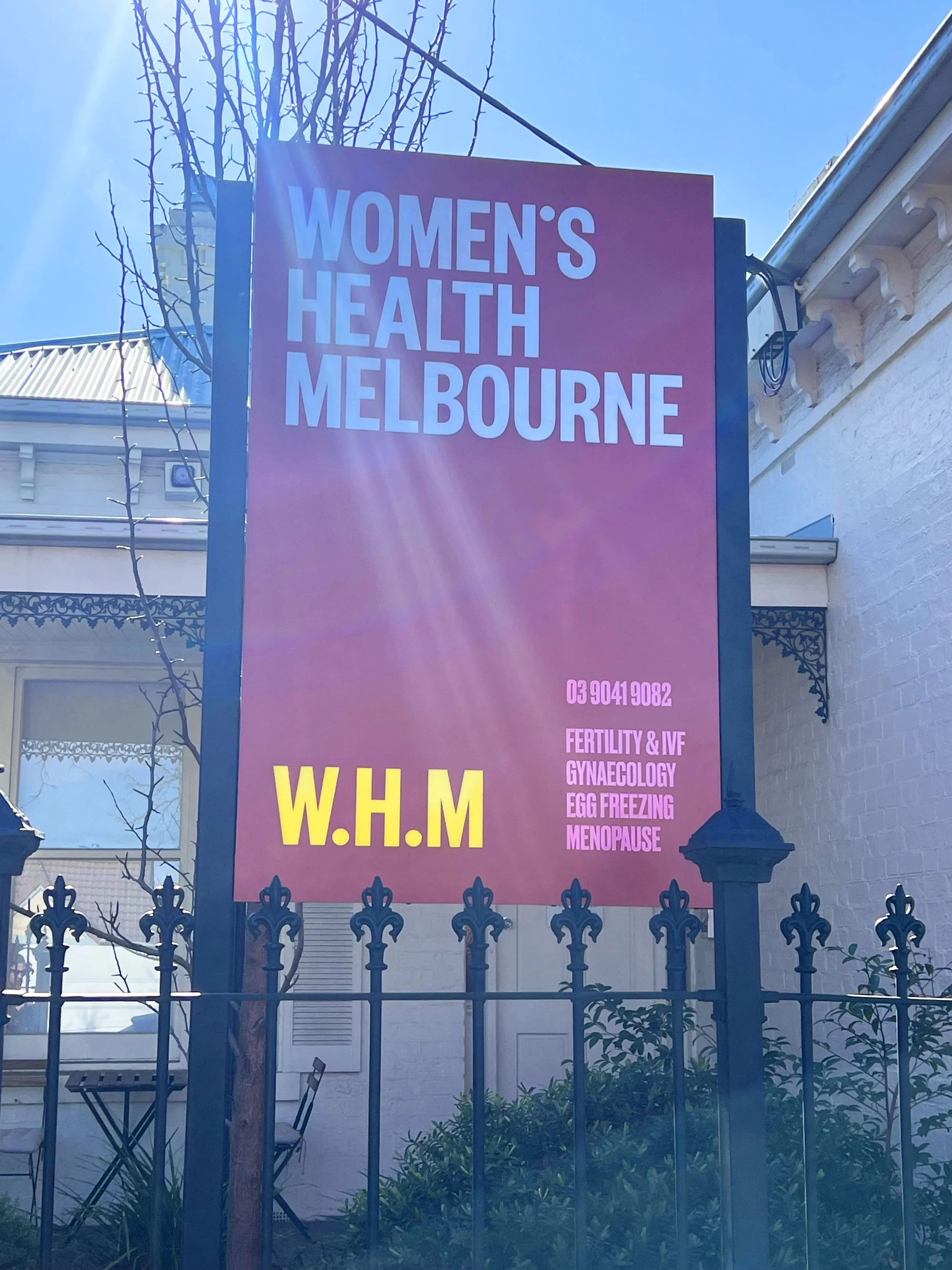
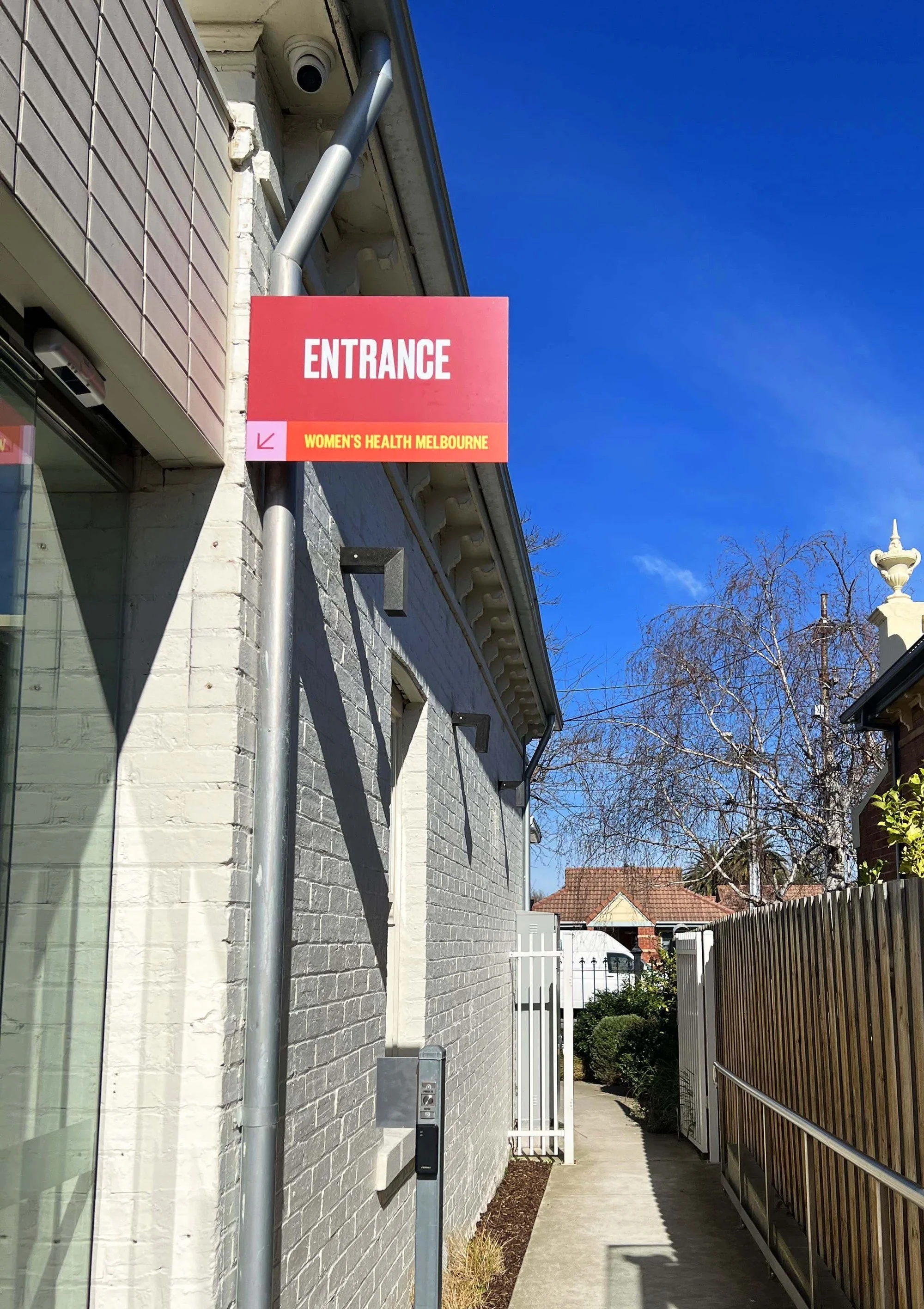
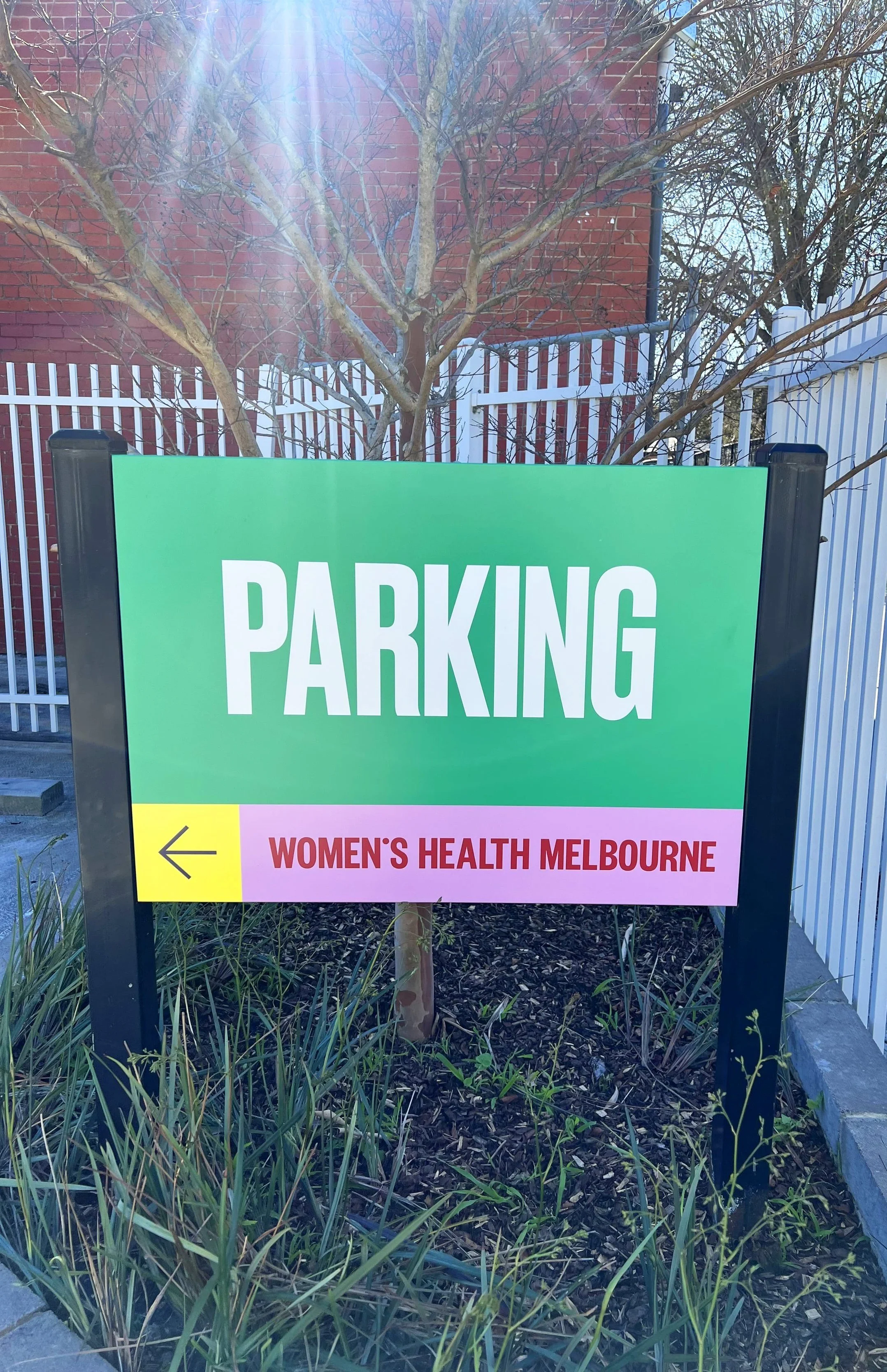
W.H.M Practice Signage